Tailwind Development Services
Tailwind interfaces that stay consistent as they grow
Tailwind CSS gives a platform one set of spacing, colour and type values that every screen draws from. ZingZee uses it on every React, Next.js and Vue build so that the hundredth screen looks like the first and a brand change is a single edit.


What Tailwind is
ZingZee's Tailwind development services cover the styling of web platforms with Tailwind CSS, a framework that gives a platform one fixed set of spacing, colour, and type values and lets engineers apply them directly in the component. Every screen draws from the same list, so a button on the hundredth screen is the same size and colour as the button on the first without anyone checking. A brand change, a new colour or a new typeface, is one edit to the token file. For a business owner, Tailwind is the reason a platform built over two years still looks like one product, and the reason a new screen costs a day and not a week of design.
What we do with Tailwind
ZingZee starts each front end with a Tailwind configuration that encodes the client's brand as design tokens: colour scales, spacing steps, type sizes, radii and shadows. Components are built from those tokens, with no bespoke CSS, so a designer's change to one value reaches every button, card and table in the platform on the next build.
A component library sits on top of the tokens. Buttons, inputs, tables, dialogs and layout primitives are written once with accessible markup, then composed into screens. Where a client needs a headless component set, ZingZee pairs Tailwind with Radix or Headless UI so that keyboard behaviour and focus management are handled by tested primitives and only the appearance is custom.
Dark mode, responsive breakpoints and print styles are configured at the token level from the first sprint, so a staff app used on a phone in a car park and a report printed for an owner come from the same components. The production build removes every unused class, and the resulting stylesheet is measured in kilobytes for a platform with hundreds of screens.
For an existing site, ZingZee introduces Tailwind alongside the current stylesheet and migrates screens in order, retiring old CSS as each one moves. Handover includes the token file, the component library and a visual reference the client's team can use to build new screens that match.
When Tailwind is the right choice
Tailwind is the right choice for any platform with many screens built over time by different people, which is every business platform ZingZee delivers. It suits companies with a brand guide that must be enforced in code, teams without a full-time designer who still want consistency, and platforms where a public site, a staff app, and a portal must share one look. It also suits Next.js and React builds, where components and their styles live together and unused styles are removed from the build automatically. ZingZee uses Tailwind on every React, Next.js, and Vue build.
When Tailwind is the wrong choice
Tailwind is the wrong choice for an existing site whose styling works and whose team knows it, where a switch would cost more than it returns. It is the wrong choice for a project that must match a corporate design system already implemented in another styling method, where ZingZee builds inside that system. It is also not the answer to a design problem: a platform with no design tokens, no component library, and no agreement on what a screen should look like needs that agreement first, which ZingZee establishes in the strategic assessment before any styling method is chosen.
Why Tailwind
Design tokens in one file
Colour, spacing and type live in the Tailwind configuration, so a rebrand or a contrast fix is one edit checked across the whole platform.
No bespoke CSS drift
Utilities replace hand-written stylesheets, so two engineers building two screens produce the same spacing and the same colours without a review catching the difference.
Speed of change
A layout change is made in the markup where the component lives, with no search through stylesheets for the rule that overrides the rule.
Small production stylesheets
Unused classes are removed at build time, so the CSS a visitor downloads stays small however many screens the platform has.
Dark mode and responsive by configuration
Variants for dark mode, breakpoints and states are declared once and applied per utility, so every component supports them from the start.
Tailwind interfaces that stay consistent as they grow

Use cases
Platform component libraries
A shared set of buttons, forms, tables and layouts for a booking, operations or finance platform with many screens.
Marketing sites with strict brand rules
Landing pages and content sites where the brand tokens are enforced by the build, with no reliance on review.
Staff and manager apps on phones
Touch-sized controls, readable type and offline-friendly layouts built from the same tokens as the desktop screens.
Dashboards and data tables
Dense layouts with consistent spacing, sortable columns and role-based views that stay legible on a laptop and a tablet.
Migration from legacy stylesheets
Screens moved one at a time from Bootstrap, SCSS or inline styles, with old CSS retired as each screen passes.
Tailwind development services
ZingZee provides.
Tailwind on every new ZingZee front end
Every React, Next.js, and Vue build ZingZee delivers is styled with Tailwind, with a design token file per platform that fixes colour, spacing, type, and radius from the brand guide.
Design systems implemented in Tailwind
ZingZee translates a client's brand guide or design files into a Tailwind configuration and a component library, so the design system exists as code the whole team applies.
Migration from older CSS to Tailwind
Bootstrap, hand-written CSS, and styled-component codebases are migrated screen by screen, with visual comparison tests to prove each screen matches before the old styles are removed.
Component libraries with documented styles
Tables, forms, buttons, dialogs, and layouts are built once, documented, and reused, so the client's team composes new screens from parts that already match.
Responsive, accessible, and themed interfaces
Phone, tablet, and desktop layouts, dark and light themes, and contrast and focus states are built from the same tokens and checked on every screen.
Tailwind development scope
- Deliverables
- A token file, a component library, and the styled screens, committed to the client's repository with the build configuration, so every screen the platform adds later draws from the same source.
- Included as standard
- A component catalogue with each state documented, visual comparison tests on the core components, lint rules that stop hard-coded values, a build step that removes unused styles, and a recorded handover.
- Design system artefacts
- Where ZingZee implements a brand guide, the client receives the token file with each value traced to the guide, a gap list of what the guide does not specify, and the decisions taken to fill it.
- Priced separately
- Creation of a brand guide where none exists, additional themes or brands after the first, a migration of screens beyond the audited count, and formal accessibility audits are quoted as separate items.
- What the client provides
- The brand guide or the designs in use, the current stylesheets on a migration, a list of the screens in scope with their priority, and a person who signs off the components.
- Outside the engagement
- Font licences, icon set subscriptions, design tool seats, and the content on the screens are the client's. Tailwind carries no licence cost, and the token file is the client's property from the first commit.
How a Tailwind project with ZingZee runs
Tailwind work runs inside ZingZee's five-phase delivery framework as part of every front-end engagement. The strategic assessment reads the brand guide, the existing screens, and the devices in use, and produces the token file and the list of components. The AI roadmap fixes the order of screens. Integration and deployment builds the component library first and then the screens from it. Adoption and enablement trains the client's team to compose new screens from the library. Governance, optimisation and scale keeps the tokens, the library, and the dependencies current. Each phase opens with a scoping workshop and closes with a hardening workshop, where every screen is checked on the client's devices, and a delivery workshop where the client signs off.
- Strategic assessment
- AI roadmap
- Integration and deployment
- Adoption and enablement
- Governance, optimisation and scale
Industries where ZingZee applies Tailwind
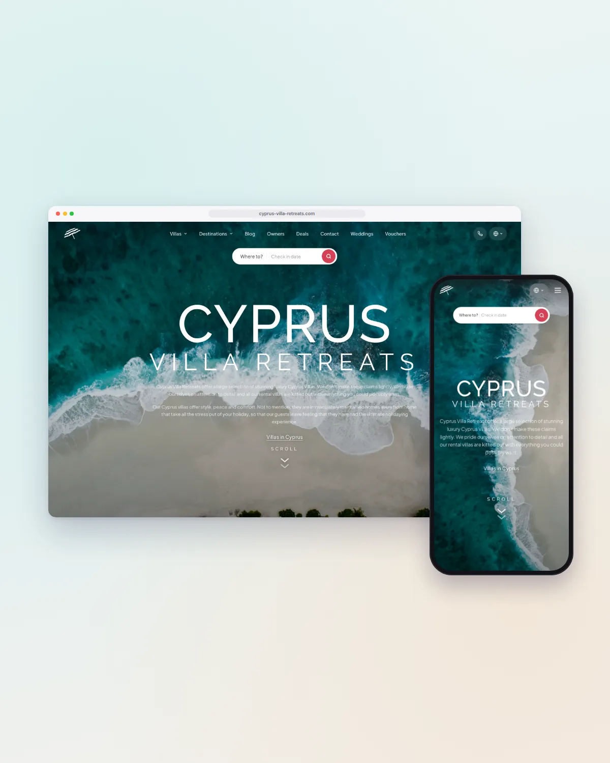
ZingZee has applied Tailwind on the multi-language booking site, staff app, and owner portal of a villa rental company, where three surfaces share one token set, and on every platform it has delivered since in financial services, retail and distribution, insurance, energy, automotive, and aviation training. The practice is the same in each sector: one token file per platform, one component library, and screens composed from it.
Tailwind tooling
ZingZee's Tailwind work uses one configuration and one set of tools on every project, so the client's team finds the same setup in every repository. The tooling covers:
- Tailwind CSS with a per-platform token configuration
- Headless component primitives for dialogs, menus, and form controls
- Storybook or an equivalent catalogue for the component library
- Visual comparison tests on migrations and on the core components
- Lint rules that stop hard-coded values outside the token file
- Build-time removal of unused styles for a small stylesheet
Tailwind engineering practices
The token file is the only place a colour, a spacing value, or a typeface is written, and a lint rule stops values written anywhere else. Components are built from the tokens and documented, and screens are composed from components, so a change to a component reaches every screen. Layouts are built for the phone first and checked on a mid-range device. Contrast and focus states are checked on every component against the accessibility standard the client's sector requires. Migrations run screen by screen with a visual comparison before the old styles are removed. At handover the client receives the configuration, the component library with its documentation, and a written guide to adding a screen.
Cost and time for Tailwind work
For a new platform, Tailwind adds no separate cost; it is how the screens are styled. The cost of a design system implementation depends on the number of components, the state of the brand guide, and the number of themes or brands. The cost of a migration depends on the number of screens and the styling methods in use. Translating a complete brand guide into a token file and a core component library is a matter of weeks. Migrating a large platform from another styling method is a matter of months, delivered screen by screen. ZingZee provides a written estimate after the strategic assessment.
What happens next?
You send the brand guide or design files, the screens you have, and the devices your people use.
An engineer reads it and replies within two working days with the shape of a strategic assessment.
You sign a non-disclosure agreement if you need one, and you receive a proposal with the phases, the estimate, and the team.
Related case studies.
Real projects, real numbers.
Frequently asked questions
Straight answers on Tailwind work with ZingZee.